Overview
The Hawaii Pidgin Bible Ministry began in the 1980s with a mission to translate the Bible into Hawaii Pidgin, staying true to the original Hebrew language. The second phase involved recording audio versions using voices of beloved local figures across the Hawaiian Islands—who generously volunteered anonymously.
The Ministry needed a one-stop digital home to house their full legacy: the written translation, audio recordings, and video content. My role was to take this deeply meaningful body of work and design an organized, welcoming, and functional website to support their mission and engage their audience.
Stakeholder Engagement
I held discovery meetings with ministry leaders to uncover user needs, define success, and understand the emotional and cultural weight of the content. They shared the importance of making this resource accessible to everyday local people—"no need fancy, just real.

English
Come Again!
Hawaii Pidgin
"Hana Hou"
English
Hi, How Are You?
Hawaii Pidgin
"Eh, Howzit?"
English
Come In
Hawaii Pidgin
"E Komo Mai"
English
Responsibility
Hawaii Pidgin
"Kuleana"
Pidgin Translation
I was intentional about preserving the cultural voice and tone, ensuring the site felt like it was truly made for the local community. English was only used where absolutely necessary for clarity, keeping the experience rooted in the language that defines the ministry’s mission.
Hawaii Pidgin Bible Ministry Website Redesign
This is the space to introduce the Services section. Briefly describe the types of services offered and highlight any special benefits or features.
Oahu, Hawaii
13 months
September 2022
Role: UX Lead
UCI Health
13 months
September 2022
Role: UX Lead
Goals
Before the migration, our SharePoint site faced a number of usability, access, and management challenges that impacted both day-to-day operations and long-term scalability. These issues made it clear that the platform was no longer meeting the needs of our nursing staff and required a complete overhaul.
Embed and organize hundreds of Bible chapter recordings.

Project Timeline

One of the early challenges was regaining momentum after key staff members returned from summer vacations. With multiple team members working on different Magnet projects, it took time to get everyone back on the same page.
Sitemap
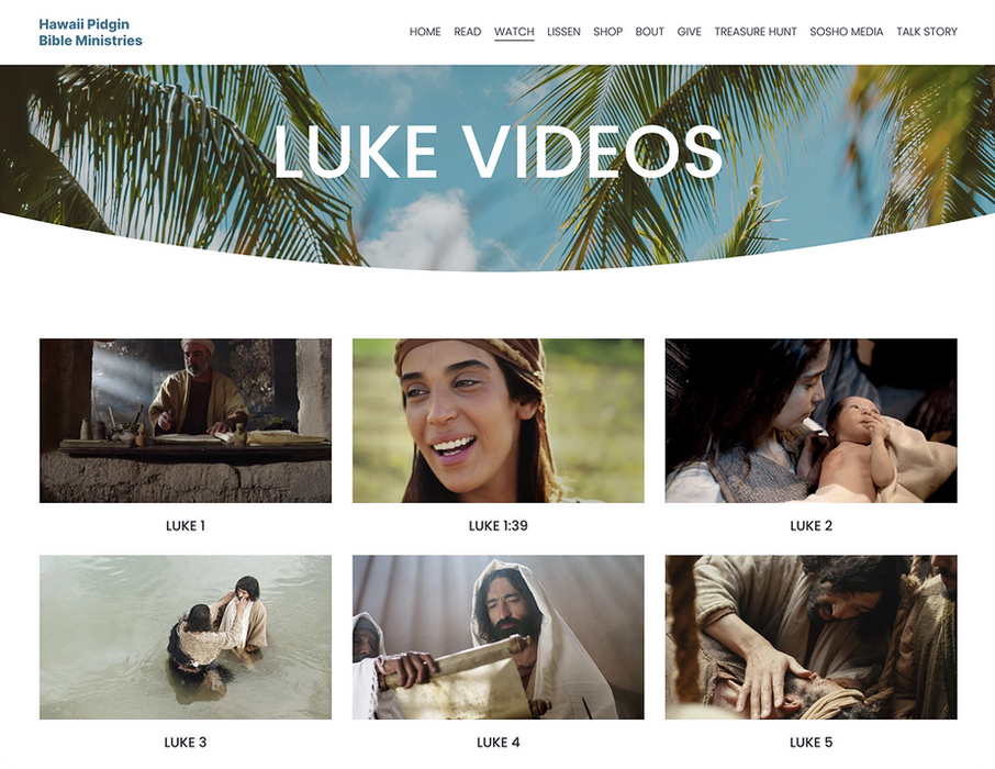
One of the biggest challenges was managing the volume of content, including hundreds of audio files spanning the entire Bible.
To make this accessible, I created a clear navigation system that followed the structure of the Bible—Testament → Book → Chapter—allowing users to quickly find specific passages. I grouped the audio content into cards grid to keep the layout clean and intuitive.

Embedded Media
One of the biggest challenges was managing the volume of content, including hundreds of audio files spanning the entire Bible.
To make this accessible, I created a clear navigation system that followed the structure of the Bible—Testament → Book → Chapter—allowing users to quickly find specific passages. I grouped the audio content into cards grid to keep the layout clean and intuitive.
Outcomes
The redesigned website delivered a culturally authentic, fully Pidgin-language experience that reflects the heart of the ministry. Audio recordings were organized for easy access, and the simplified design made it user-friendly for all, especially older and less tech-savvy users. The site now serves as a lasting digital home for the Hawaii Pidgin Bible, preserving its legacy and deepening community engagement.
Culturally Aligned
Launched a fully translated Hawaii Pidgin website that reflects the heart and voice of the local community.
Organized Media
Structured and embedded hundreds of audio Bible recordings for easy, chapter-by-chapter navigation.
UX Friendly
Built an intuitive, accessible interface tailored for older users and those with limited tech experience.
Long Term ImpactCreated a sustainable digital archive that preserves the ministry’s legacy and deepens community engagement.
Project Takeaways
Designing with Cultural Context Matters
Language, tone, and visual choices must reflect the audience’s identity to create a meaningful experience.
Simplicity is Powerful
A clean, intuitive interface can make complex content accessible—even for users with limited tech experience.
Content Structure is Key
Organizing large volumes of media into a clear hierarchy improves usability and encourages deeper engagement.
Community-Driven Design Leaves Impact
Honoring the voice and values of the community builds trust and turns a website into a living archive.
Problems
The outdated nursing website came with outdated challenges:
Visibility – A public-facing Nursing website was required to meet Magnet designation criteria and showcase key initiatives.
Delays – Required IT involvement for every content update, slowing down responsiveness.
Control – Nursing lacked direct control over content updates and structure.
Confusion – There was no clear information architecture, making it hard for users to find relevant resources.
Outdated – The original Nursing website was outdated and no longer met current design or accessibility expectations.
Nursing Website Redesign
This is the space to introduce the Services section. Briefly describe the types of services offered and highlight any special benefits or features.
UCI Health
13 months
September 2022
Role: UX Lead


